5 Modern CSS Features in 2025 That Will Save You Hours of Coding Headaches
Discover the top CSS features in 2025 that simplify web design—CSS Grid, Flexbox, Variables, and more. Learn how to use them, avoid common mistakes, and build better websites faster.
Introduction
Imagine writing just a few lines of CSS and watching your website layout snap into place like magic. No more endless tweaking, no more frustrating alignment issues—just clean, efficient code that works. Sounds too good to be true? Welcome to modern CSS in 2025.
Gone are the days of clunky floats and hacky workarounds. Today’s CSS is smarter, faster, and more powerful than ever. Whether you’re a beginner or a seasoned developer, these new features will change how you build websites. Let’s dive into the tools that will make your coding life easier—starting now.
Modern CSS Features That Will Make Your Life Easier in 2025
1. CSS Grid vs. Flexbox: When to Use Each
CSS Grid and Flexbox are both layout tools, but they solve different problems. Grid is perfect for two-dimensional layouts (rows AND columns), while Flexbox excels at one-dimensional layouts (either rows OR columns).
– Use Grid for complex designs like full-page layouts or card grids.
– Use Flexbox for simpler, linear arrangements like navigation menus or centered content.
Example:
“`css
.container {
display: grid;
grid-template-columns: 1fr 1fr 1fr;
}
“`
2. CSS Variables: Theming Made Easy
CSS Variables (custom properties) let you reuse values across your stylesheet. Change one value, and it updates everywhere.
Example:
css
:root {
–primary-color: #3498db;
}
.button {
background-color: var(–primary-color);
}
3. New Selectors and Properties
– `:is()` and `:where()` simplify selector grouping.
– `gap` property adds spacing between Grid/Flexbox items without margins.
4. **Browser Compatibility Tips
Always check [Can I Use](https://caniuse.com) before adopting new features. Use fallbacks for older browsers.
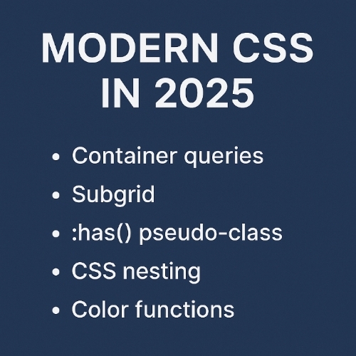
5. Future Trends to Watch
– Container Queries (style elements based on their size, not the viewport).
– Scroll Snap for smoother scrolling experiences.
Important Questions, Answers and Explanations
1. Explain how CSS Grid and Flexbox differ in layout management and when to use each.
Grid handles rows and columns together, ideal for overall page structure. Flexbox aligns items in a single direction, great for smaller components like menus.
2. Provide a simple example of using CSS Variables in a project.
Define a variable in `:root` and reuse it with `var()`, like setting a theme color once and applying it everywhere.
3. What are some common mistakes beginners make when implementing modern CSS features?
Overusing Grid for simple layouts, not checking browser support, or forgetting to use `gap` instead of margins for spacing.
4. Can you recommend any online resources or tools for learning these CSS features?
MDN Web Docs, CSS-Tricks, and freeCodeCamp offer excellent tutorials.
5. How do modern CSS features contribute to better accessibility in web design?
Features like `focus-visible` improve keyboard navigation, and Grid/Flexbox make responsive designs more adaptable for screen readers.
Important Phrases Explained
1. CSS Grid
A layout system for creating two-dimensional designs with rows and columns, replacing old float-based layouts.
2. Flexbox
A one-dimensional layout tool for aligning items in a row or column, perfect for dynamic spacing.
3. CSS Variables
Reusable custom properties that streamline theming and reduce repetitive code.
4. Container Queries
Upcoming feature allowing elements to adapt styles based on their own size, not just the screen size.
5. Scroll Snap
CSS feature that controls scrolling behavior, making slideshows or galleries smoother.
Questions Also Asked by Other People Answered
1. “Is CSS Grid better than Flexbox?”
No—they serve different purposes. Grid is for full layouts; Flexbox is for smaller, flexible components.
2. “How do I start using CSS Variables?”
Declare them in `:root` and reference them with `var()`, like setting a brand color once.
3. “What’s the easiest way to learn modern CSS?”
Start with free tutorials on MDN or CSS-Tricks, then practice with small projects.
4. “Will these features work on all browsers?”
Most modern browsers support them, but always check Can I Use and provide fallbacks.
5. “How does CSS improve accessibility?”
Properly structured layouts and focus styles help screen readers and keyboard users navigate easily.
Summary
Modern CSS in 2025 is all about efficiency—Grid and Flexbox eliminate layout headaches, Variables simplify theming, and new selectors cut down on repetitive code. By mastering these tools, you’ll build better websites faster, with fewer bugs and more accessibility. Start experimenting today, and you’ll wonder how you ever coded without them.
#CSS #WebDevelopment #FrontEnd #CSSGrid #Flexbox #WebDesign #Coding #Tech #Accessibility #LearnToCod