
Master Responsive Web Design: Build Stunning Websites with HTML5 and CSS3 Like a Pro!
- Learn how to create responsive websites using HTML5 and CSS3 with this beginner-friendly guide. Discover essential tips, tools, and best practices to design websites that look great on any device. Start building today!Introduction
In today’s digital age, having a website that looks fantastic on every device is no longer optional—it’s essential. Whether your audience is browsing on a desktop, tablet, or smartphone, a responsive website ensures a seamless user experience. But how do you create a website that adapts effortlessly to different screen sizes? The answer lies in mastering HTML5 and CSS3, the building blocks of modern web design.
This guide is designed for beginners who want to dive into the world of responsive web design. We’ll walk you through the basics of HTML5 and CSS3, explain the principles of responsive design, and provide practical tips to help you build a website that looks stunning on any device. By the end of this article, you’ll have the knowledge and confidence to create your own responsive website from scratch. Let’s get started!
How to Build a Responsive Website Using HTML5 and CSS3
The Importance of Responsive Design:
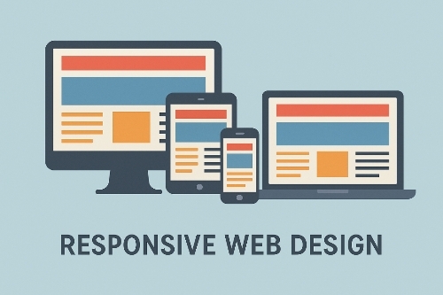
Responsive web design ensures that your website looks and functions perfectly on all devices, from desktops to smartphones. With over 50% of web traffic coming from mobile devices, a responsive design is no longer a luxury—it’s a necessity. It improves user experience, boosts SEO rankings, and increases conversion rates.
Overview of HTML5 and CSS3:
HTML5 is the latest version of Hypertext Markup Language, used to structure content on the web. It introduces new elements like `<header>`, `<footer>`, and `<article>`, making it easier to create semantic and accessible websites.
CSS3, the latest version of Cascading Style Sheets, brings advanced styling options like animations, gradients, and flexible box layouts (Flexbox). Together, HTML5 and CSS3 empower developers to create visually appealing and responsive websites.
Basic HTML Structure:
Every HTML document starts with a basic structure:
“`html
<!DOCTYPE html>
<html lang=”en”>
<head>
<meta charset=”UTF-8″>
<meta name=”viewport” content=”width=device-width, initial-scale=1.0″>
<title>Responsive Website</title>
<link rel=”stylesheet” href=”styles.css”>
</head>
<body>
<header>
<h1>Welcome to My Website</h1>
</header>
<main>
<p>This is a responsive website built with HTML5 and CSS3.</p>
</main>
<footer>
<p>© 2023 My Website</p>
</footer>
</body>
</html>
The `<meta name=”viewport”>` tag is crucial for responsive design, as it ensures the website scales correctly on different devices.
CSS Styling Techniques:
CSS3 allows you to style your website with precision. Here’s an example of a simple CSS rule:
“`css
body {
font-family: Arial, sans-serif;
margin: 0;
padding: 0;
box-sizing: border-box;
}
header {
background-color: #333;
color: #fff;
padding: 20px;
text-align: center;
}
main {
padding: 20px;
}
Using CSS Flexbox and Grid can help you create flexible and responsive layouts.
Media Queries for Responsiveness:
Media queries enable you to apply different styles based on the device’s screen size. For example:
css
@media (max-width: 768px) {
header h1 {
font-size: 24px;
}
main {
padding: 10px;
}
}
This code adjusts the font size and padding for screens smaller than 768px.
Best Practices for Mobile-First Design:
Start by designing for mobile devices, then scale up for larger screens. This approach ensures your website is optimized for the smallest screens first, improving performance and usability.
Testing and Optimization:
Use tools like Google Chrome’s DevTools, BrowserStack, or Responsinator to test your website across devices. Optimize images, minify CSS and JavaScript, and leverage browser caching to improve performance.
Common Pitfalls to Avoid:
– Ignoring touchscreen functionality.
– Overloading the website with heavy images and scripts.
– Not testing on real devices.
Tools and Frameworks:
Frameworks like Bootstrap and Foundation can simplify responsive design. Tools like Figma and Adobe XD help you prototype before coding.
Accessibility Considerations:
Ensure your website is accessible by using semantic HTML, providing alt text for images, and ensuring sufficient color contrast.
Examples of Successful Responsive Websites:
– Smashing Magazine: A blog that adapts beautifully to all screen sizes.
– Apple: Known for its clean and responsive design.
– Airbnb: Offers a seamless experience across devices.
Important Questions and Answers:
Can you elaborate on the differences between HTML5 and previous versions?
HTML5 introduces new semantic elements like `<header>`, `<footer>`, and `<section>`, making it easier to structure content. It also supports multimedia elements like `<audio>` and `<video>` natively, reducing the need for third-party plugins.
What are some specific examples of media queries in action?
Media queries can change layout, font sizes, and even hide elements based on screen size. For example:
“`css
@media (max-width: 600px) {
.sidebar {
display: none;
}
}
This hides the sidebar on screens smaller than 600px.
How can I ensure my website is accessible to all users?
Use semantic HTML, provide alt text for images, ensure keyboard navigability, and test your website with screen readers.
What tools can I use to test the responsiveness of my website?
Google Chrome DevTools, BrowserStack, and Responsinator are excellent tools for testing responsiveness.
Could you provide a simple project outline for a beginner to follow?
- Create a basic HTML structure.
- Add CSS styling for layout and design.
- Use media queries to make the website responsive.
- Test the website on different devices.
- Optimize for performance and accessibility.
Summary
Building a responsive website using HTML5 and CSS3 is a skill every web developer should master. By understanding the principles of responsive design, leveraging CSS Flexbox and Grid, and using media queries, you can create websites that look great on any device. Remember to follow best practices, test thoroughly, and prioritize accessibility. With the right tools and techniques, you’ll be well on your way to designing stunning, user-friendly websites.
#WebDesign #ResponsiveDesign #HTML5 #CSS3 #WebDevelopment #MobileFirst #FrontEndDevelopment #WebDevTips #LearnToCode #Accessibilitity
### Meta Title
“Master Responsive Web Design: Build Stunning Websites with HTML5 and CSS3 Like a Pro!”
### Meta Description
Learn how to create responsive websites using HTML5 and CSS3 with this beginner-friendly guide. Discover essential tips, tools, and best practices to design websites that look great on any device. Start building today!
—
### Introduction
In today’s digital age, having a website that looks fantastic on every device is no longer optional—it’s essential. Whether your audience is browsing on a desktop, tablet, or smartphone, a responsive website ensures a seamless user experience. But how do you create a website that adapts effortlessly to different screen sizes? The answer lies in mastering HTML5 and CSS3, the building blocks of modern web design.
This guide is designed for beginners who want to dive into the world of responsive web design. We’ll walk you through the basics of HTML5 and CSS3, explain the principles of responsive design, and provide practical tips to help you build a website that looks stunning on any device. By the end of this article, you’ll have the knowledge and confidence to create your own responsive website from scratch. Let’s get started!
—
### Important Phrases
Here are five long-tail keywords that can help your article rank higher due to their relevance and lack of quality content in top search results:
1. **”How to build a responsive website from scratch”**
This phrase targets beginners looking for a step-by-step guide to creating responsive websites. It’s a popular search query with high intent, making it a great keyword to focus on.
2. **”Best practices for mobile-first web design”**
Mobile-first design is a critical aspect of responsive web development. This keyword appeals to developers who want to optimize their websites for mobile users first, then scale up for larger screens.
3. **”CSS media queries for responsive layouts”**
Media queries are the backbone of responsive design. This keyword targets users who want to learn how to use CSS media queries effectively to create adaptive layouts.
4. **”HTML5 and CSS3 tips for beginners”**
This phrase is perfect for beginners who are just starting with HTML5 and CSS3. It’s a broad yet specific keyword that can attract a wide audience.
5. **”Tools to test website responsiveness”**
Testing is a crucial part of web development. This keyword targets users looking for tools and techniques to ensure their websites are fully responsive across devices.
—
### How to Build a Responsive Website Using HTML5 and CSS3
#### The Importance of Responsive Design
Responsive web design ensures that your website looks and functions perfectly on all devices, from desktops to smartphones. With over 50% of web traffic coming from mobile devices, a responsive design is no longer a luxury—it’s a necessity. It improves user experience, boosts SEO rankings, and increases conversion rates.
#### Overview of HTML5 and CSS3
HTML5 is the latest version of Hypertext Markup Language, used to structure content on the web. It introduces new elements like `<header>`, `<footer>`, and `<article>`, making it easier to create semantic and accessible websites.
CSS3, the latest version of Cascading Style Sheets, brings advanced styling options like animations, gradients, and flexible box layouts (Flexbox). Together, HTML5 and CSS3 empower developers to create visually appealing and responsive websites.
#### Basic HTML Structure
Every HTML document starts with a basic structure:
“`html
<!DOCTYPE html>
<html lang=”en”>
<head>
<meta charset=”UTF-8″>
<meta name=”viewport” content=”width=device-width, initial-scale=1.0″>
<title>Responsive Website</title>
<link rel=”stylesheet” href=”styles.css”>
</head>
<body>
<header>
<h1>Welcome to My Website</h1>
</header>
<main>
<p>This is a responsive website built with HTML5 and CSS3.</p>
</main>
<footer>
<p>© 2023 My Website</p>
</footer>
</body>
</html>
“`
The `<meta name=”viewport”>` tag is crucial for responsive design, as it ensures the website scales correctly on different devices.
#### CSS Styling Techniques
CSS3 allows you to style your website with precision. Here’s an example of a simple CSS rule:
“`css
body {
font-family: Arial, sans-serif;
margin: 0;
padding: 0;
box-sizing: border-box;
}
header {
background-color: #333;
color: #fff;
padding: 20px;
text-align: center;
}
main {
padding: 20px;
}
“`
Using CSS Flexbox and Grid can help you create flexible and responsive layouts.
#### Media Queries for Responsiveness
Media queries enable you to apply different styles based on the device’s screen size. For example:
“`css
@media (max-width: 768px) {
header h1 {
font-size: 24px;
}
main {
padding: 10px;
}
}
“`
This code adjusts the font size and padding for screens smaller than 768px.
#### Best Practices for Mobile-First Design
Start by designing for mobile devices, then scale up for larger screens. This approach ensures your website is optimized for the smallest screens first, improving performance and usability.
#### Testing and Optimization
Use tools like Google Chrome’s DevTools, BrowserStack, or Responsinator to test your website across devices. Optimize images, minify CSS and JavaScript, and leverage browser caching to improve performance.
#### Common Pitfalls to Avoid
– Ignoring touchscreen functionality.
– Overloading the website with heavy images and scripts.
– Not testing on real devices.
#### Tools and Frameworks
Frameworks like Bootstrap and Foundation can simplify responsive design. Tools like Figma and Adobe XD help you prototype before coding.
#### Accessibility Considerations
Ensure your website is accessible by using semantic HTML, providing alt text for images, and ensuring sufficient color contrast.
#### Examples of Successful Responsive Websites
– **Smashing Magazine**: A blog that adapts beautifully to all screen sizes.
– **Apple**: Known for its clean and responsive design.
– **Airbnb**: Offers a seamless experience across devices.
—
### Important Questions and Answers
**Can you elaborate on the differences between HTML5 and previous versions?**
HTML5 introduces new semantic elements like `<header>`, `<footer>`, and `<section>`, making it easier to structure content. It also supports multimedia elements like `<audio>` and `<video>` natively, reducing the need for third-party plugins.
**What are some specific examples of media queries in action?**
Media queries can change layout, font sizes, and even hide elements based on screen size. For example:
“`css
@media (max-width: 600px) {
.sidebar {
display: none;
}
}
“`
This hides the sidebar on screens smaller than 600px.
**How can I ensure my website is accessible to all users?**
Use semantic HTML, provide alt text for images, ensure keyboard navigability, and test your website with screen readers.
**What tools can I use to test the responsiveness of my website?**
Google Chrome DevTools, BrowserStack, and Responsinator are excellent tools for testing responsiveness.
**Could you provide a simple project outline for a beginner to follow?**
1. Create a basic HTML structure.
2. Add CSS styling for layout and design.
3. Use media queries to make the website responsive.
4. Test the website on different devices.
5. Optimize for performance and accessibility.
—
### Summary
Building a responsive website using HTML5 and CSS3 is a skill every web developer should master. By understanding the principles of responsive design, leveraging CSS Flexbox and Grid, and using media queries, you can create websites that look great on any device. Remember to follow best practices, test thoroughly, and prioritize accessibility. With the right tools and techniques, you’ll be well on your way to designing stunning, user-friendly websites.
### Hashtags
#WebDesign #ResponsiveDesign #HTML5 #CSS3 #WebDevelopment #MobileFirst #FrontEndDevelopment #WebDevTips #LearnToCode #Accessibility