Mastering Python Data Visualization: A Beginner’s Guide to Creating Stunning Data Stories (2025)
Discover how to transform raw data into compelling visualizations using Python. Learn essential libraries, best practices, and expert tips for creating impactful data stories. Perfect for beginners and intermediate developers.
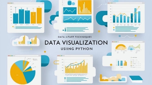
The Art of Data Visualization with Python: A Comprehensive Guide
Introduction:
In today’s data-driven world, the ability to transform raw numbers into compelling visual stories has become an invaluable skill. Whether you’re analyzing market trends, presenting research findings, or exploring customer behavior, data visualization is your key to unlocking insights that might otherwise remain hidden in spreadsheets and databases. This comprehensive guide will walk you through the fundamentals of data visualization using Python, empowering you to create stunning, informative visualizations that communicate your data’s story effectively.
The Power of Visual Data:
Imagine trying to understand the patterns in a dataset with thousands of rows by looking at raw numbers alone. Overwhelming, right? This is where data visualization becomes your secret weapon. By leveraging Python’s robust visualization libraries, you can transform complex datasets into clear, intuitive visual representations that reveal patterns, trends, and insights at a glance.
Getting Started with Python Data Visualization
Before diving into creating visualizations, let’s set up our environment. Python offers several powerful libraries for data visualization, each with its unique strengths:
First Steps: Setting Up Your Environment
python
# Essential libraries for data visualization
import pandas as pd
import matplotlib.pyplot as plt
import seaborn as sns
import plotly.express as px
# Optional but useful libraries
import numpy as np
from plotly.subplots import make_subplots
import plotly.graph_objects as go
Understanding Data Types and Visualization Choices
Different types of data call for different visualization approaches. Let’s break down the main categories:
Numerical Data:
Continuous data (like temperature, salary, or time) works well with line charts, scatter plots, and histograms
Discrete data (like counts or ratings) is best represented using bar charts or box plots
Categorical Data:
Nominal data (categories without order) can be visualized using bar charts or pie charts
Ordinal data (ordered categories) works well with ordered bar charts or heat maps
Temporal Data:
Time series data shines in line charts and area charts
Seasonal patterns can be highlighted using circular plots or heat maps
Creating Basic Visualizations
Let’s start with some fundamental visualizations using a sample dataset:
python
# Sample dataset creation
data = pd.DataFrame({
‘Month’: pd.date_range(‘2024-01-01′, periods=12, freq=’M’),
‘Sales’: np.random.normal(100, 15, 12),
‘Category’: np.random.choice([‘A’, ‘B’, ‘C’], 12)
})
# Line Chart Example
plt.figure(figsize=(10, 6))
plt.plot(data[‘Month’], data[‘Sales’], marker=’o’)
plt.title(‘Monthly Sales Trend’)
plt.xlabel(‘Month’)
plt.ylabel(‘Sales’)
plt.grid(True)
plt.xticks(rotation=45)
plt.tight_layout()
Best Practices for Effective Visualization
Choose the Right Chart Type
Bar charts for comparing categories
Line charts for trends over time
Scatter plots for relationships between variables
Pie charts for parts of a whole (use sparingly)
Color Selection
Use colorblind-friendly palettes
Apply consistent color schemes
Avoid using too many colors
Ensure sufficient contrast
Clear Labeling
Descriptive titles
Meaningful axis labels
Appropriate legend placement
Clear data annotations when necessary
Data Preparation and Cleaning
Handle missing values appropriately
Remove outliers when justified
Normalize data when comparing different scales
Validate data integrity
Interactive Visualizations with Plotly
python
# Creating an interactive scatter plot
fig = px.scatter(data, x=’Month’, y=’Sales’, color=’Category’,
title=’Interactive Sales Analysis’,
hover_data=[‘Sales’])
fig.update_layout(
xaxis_title=’Month’,
yaxis_title=’Sales’,
legend_title=’Category’
)
Real-World Applications
Business Analytics
Sales trend analysis
Customer behavior visualization
Market segmentation
Performance metrics dashboards
Scientific Research
Experimental data presentation
Statistical analysis visualization
Research findings communication
Pattern recognition
Data Journalism
Story-driven data presentations
Interactive news graphics
Social trend analysis
Public data exploration
Important Questions and Answers:
Q: What are some practical examples of data visualization projects a beginner can start with?
A: Beginners can start with personal data projects like visualizing their monthly expenses, analyzing social media engagement patterns, or creating weather trend visualizations using public APIs. These projects provide hands-on experience while working with familiar data. Another excellent starting point is analyzing public datasets from platforms like Kaggle or data.gov, where you can create visualizations of population demographics, economic indicators, or environmental data.
Q: Can you elaborate on how to choose the right visualization for different types of data?
A: The choice of visualization depends primarily on your data type and the story you want to tell. For comparing categories, bar charts work best. Time-series data is most effectively shown through line charts. When exploring relationships between variables, scatter plots are ideal. For showing composition, consider pie charts or stacked bar charts. Always consider your audience’s familiarity with different chart types and choose visualizations that clearly communicate your message without requiring extensive explanation.
Q: What are some common mistakes beginners make in data visualization, and how can they be avoided?
A: Common mistakes include choosing inappropriate chart types, using too many colors or decorative elements, and not properly cleaning data before visualization. To avoid these pitfalls, always start with clear objectives, keep designs simple and focused, and ensure your data is properly preprocessed. Another frequent mistake is creating misleading visualizations by manipulating scales or using inappropriate comparisons. Always maintain transparency and accuracy in your representations.
Q: How can interactive visualizations enhance the understanding of data?
A: Interactive visualizations allow users to explore data at their own pace and focus on aspects that interest them most. Features like zooming, filtering, and hovering for additional information provide multiple layers of insight. This interactivity helps users discover patterns and relationships that might not be immediately apparent in static visualizations. It also makes complex data more accessible and engaging for diverse audiences.
Q: What resources do you recommend for someone looking to deepen their knowledge of data visualization in Python?
A: For comprehensive learning, consider online courses on platforms like Coursera and edX that focus on data visualization with Python. The official documentation for libraries like Matplotlib, Seaborn, and Plotly provides excellent references. Books like “Python Data Science Handbook” by Jake VanderPlas and “Fundamentals of Data Visualization” by Claus Wilke are valuable resources. Additionally, following data visualization experts on social media and participating in data visualization communities can provide ongoing learning opportunities.
Other Key Issues By our Fans:
How to Optimize Data Visualization Performance in Python?
Data visualization performance can significantly impact user experience, especially when dealing with large datasets. Understanding optimization techniques, such as using appropriate data structures and efficient plotting methods, is crucial for creating responsive visualizations. Additionally, leveraging hardware acceleration and implementing proper memory management can greatly improve rendering speeds.
Advanced Customization Techniques for Python Visualizations:
Mastering advanced customization options allows you to create unique and branded visualizations. This includes understanding color theory, typography in data visualization, and creating custom themes. Learning to modify default settings and create reusable styling templates can help maintain consistency across multiple visualizations.
Integrating Data Visualization with Web Applications:
Modern web applications often require interactive data visualizations. Understanding how to integrate Python visualization libraries with web frameworks like Flask or Django, and learning about JavaScript visualization libraries that can work with Python backends, opens up possibilities for creating dynamic, web-based data visualization applications.
Automated Reporting with Python Visualization Tools:
Automating the creation of visual reports can save significant time and ensure consistency. This involves learning how to generate visualizations programmatically, create templates for different types of reports, and export visualizations in various formats suitable for different platforms and purposes.
Data Visualization for Machine Learning Models:
Visualizing machine learning models and their results requires specific techniques. This includes creating confusion matrices, ROC curves, feature importance plots, and decision boundary visualizations. Understanding how to effectively communicate model performance and insights through visualization is crucial for data scientists.
Summary:
This comprehensive guide to data visualization with Python provides beginners with a solid foundation for creating impactful visual representations of data. We’ve covered essential concepts from basic chart types to advanced interactive visualizations, emphasizing best practices and common pitfalls to avoid. By following these guidelines and continuously practicing with real-world datasets, you’ll develop the skills needed to create compelling data stories that engage and inform your audience. Remember that effective data visualization is both an art and a science – while technical skills are important, developing an eye for design and understanding your audience’s needs are equally crucial for success.
#DataVisualization
#PythonProgramming
#DataScience
#DataAnalytics
#PyViz
#Matplotlib
#Seaborn
#Plotly
#DataStoryTelling
#TechTutoria