Mastering Data Visualization: Transform Complex Data into Stunning Visual Stories
Discover powerful data visualization techniques to turn complex data into captivating visuals. Learn how to make your data speak volumes and engage your audience like never before!
Introduction:
In today’s data-driven world, information is everywhere. But raw data, no matter how valuable, often fails to capture attention or convey meaning effectively. This is where data visualization comes into play. By transforming complex datasets into visually appealing and easy-to-understand graphics, you can unlock the true potential of your data. Whether you’re a web designer, marketer, or data enthusiast, mastering data visualization techniques is essential to making your content stand out. In this article, we’ll explore the art and science of turning numbers into narratives, and how you can use these techniques to create visuals that not only inform but also inspire.
Data Visualization Techniques: Turning Complex Data into Compelling Visuals
In this digital age, data is often referred to as the new oil. But just like crude oil, raw data needs refining to unlock its true value. This is where data visualization steps in. By converting complex datasets into visually engaging graphics, you can make your data not only understandable but also memorable. Whether you’re designing a website, presenting a report, or creating an infographic, the right visualization techniques can make all the difference.
Why Data Visualization Matters
Humans are visual creatures. We process images faster than text, and we’re more likely to remember information presented visually. Data visualization leverages this innate ability, turning abstract numbers into concrete visuals that tell a story. From bar charts and pie graphs to heat maps and interactive dashboards, the possibilities are endless. But creating effective visualizations requires more than just technical skills; it demands an understanding of design principles, audience needs, and the story you want to tell.
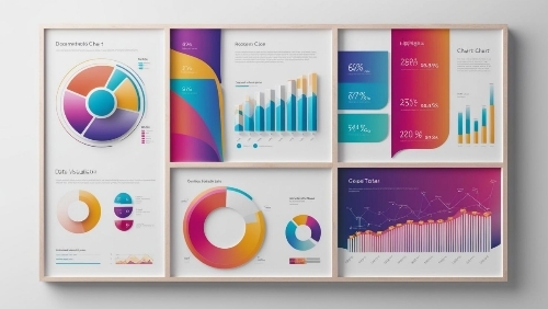
Choosing the Right Visualization
The first step in creating compelling visuals is selecting the right type of chart or graph. Here are some common options and when to use them:
– Bar Charts: Ideal for comparing quantities across categories.
– Line Graphs:Perfect for showing trends over time.
– Pie Charts:Best for illustrating proportions within a whole.
– Scatter Plots:Useful for identifying relationships between variables.
– Heat Maps: Great for visualizing density or intensity across a geographic area.
Each type of visualization has its strengths and limitations, so it’s important to choose the one that best suits your data and your message.
Design Principles for Effective Visualizations
Once you’ve chosen the right type of visualization, the next step is to design it in a way that’s both aesthetically pleasing and easy to understand. Here are some key principles to keep in mind:
– Simplicity: Avoid clutter and focus on the most important data points.
– Color: Use color strategically to highlight key information and create contrast.
– Typography: Choose fonts that are easy to read and use hierarchy to guide the viewer’s eye.
– Consistency: Maintain a consistent style throughout your visualization to create a cohesive look.
Interactive Visualizations
In the age of web technologies, static visuals are no longer enough. Interactive visualizations allow users to explore data on their own terms, making the experience more engaging and informative. Tools like D3.js, Tableau, and Power BI make it easy to create interactive charts and dashboards that can be embedded directly into websites. By allowing users to filter, sort, and drill down into the data, you can create a more personalized and impactful experience.
Real-World Applications
Data visualization isn’t just for data scientists; it’s a valuable tool for a wide range of industries. Here are a few examples:
– Marketing: Visualize customer demographics and behavior to create targeted campaigns.
– Healthcare: Use heat maps to track the spread of diseases or bar charts to compare treatment outcomes.
– Finance: Create interactive dashboards to monitor stock performance or budget allocations.
– Education: Use infographics to make complex concepts more accessible to students.
Conclusion
Data visualization is a powerful tool for turning complex data into compelling visuals that inform, engage, and inspire. By choosing the right type of visualization, applying design principles, and leveraging interactive technologies, you can create visuals that not only look great but also tell a story. Whether you’re a web designer, marketer, or data enthusiast, mastering these techniques will help you stand out in a crowded digital landscape. So, the next time you’re faced with a mountain of data, remember: the right visualization can turn it into a masterpiece.
Summary:
Data visualization is more than just pretty charts and graphs; it’s a powerful tool for storytelling. By converting complex data into compelling visuals, you can make information more accessible, engaging, and actionable. This article dives into the best techniques for creating impactful visualizations, from choosing the right chart types to leveraging color and design principles. Whether you’re presenting data to clients, colleagues, or a broader audience, these strategies will help you communicate your message clearly and effectively. Embrace the power of data visualization and turn your data into a visual masterpiece that resonates with your audience.
#DataVisualization #WebDesign #DataDriven #VisualStorytelling #UXDesign #DataAnalytics #Infographics #WebDevelopment #DataScience #CreativeDesign