From Chaos to Clarity: The Ultimate Guide to Mastering Web-Based Data Visualization for Beginners – Part 1
– Unveiling the Secrets of Effective Data Storytelling: A Comprehensive Roadmap for Web Visualization Success
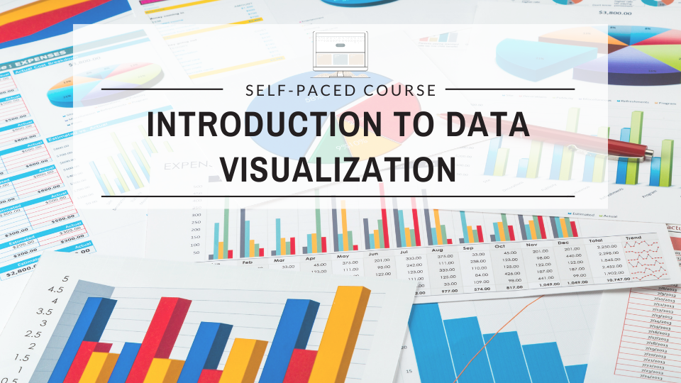
Introduction to Data Visualization:
In today’s data-driven world, the ability to effectively communicate complex information through visuals is a game-changer. Whether you’re a business professional, researcher, or data enthusiast, mastering the art of web-based data visualization can unlock new opportunities for engaging your audience and driving valuable insights. This comprehensive guide is your ultimate companion on the journey from chaos to clarity, offering a beginner-friendly approach to crafting compelling and impactful data visualizations for the web.
In this exposition, we are going to look at discussions on the importance of data visualization, key principles for effective visualization, popular tools and platforms for web-based data visualization, best practices for creating visually appealing charts and graphs, and tips for selecting the right visualization type for different data sets.
What is Data Visualization?
Data visualization is a powerful tool that helps to communicate complex information in a clear and concise manner. It is particularly important in today’s data-driven world, where vast amounts of data are generated every day. By presenting data in a visual format, it becomes easier to identify patterns, trends, and relationships that might otherwise go unnoticed in raw data.
Principles of effective data visualization:
Before digging deeper into the details, it is essential to understand the key principles of effective data visualization:
- Clarity: The primary goal of data visualization is to convey information in a clear and understandable way. Avoid cluttering your visualizations with unnecessary elements or complex designs that might distract from the main message.
- Accuracy: Ensure that your visualizations accurately represent the underlying data. Distorting or misrepresenting data can lead to misleading conclusions.
- Relevance: Choose visualizations that are relevant to the data you’re trying to represent and the message you want to convey. Different types of data require different visualization techniques.
- Accessibility: Make your visualizations accessible to a diverse audience, including those with color blindness or other visual impairments.
Now, let’s explore some popular tools and platforms for web-based data visualization:
- JavaScript Libraries: Libraries like D3.js, Chart.js, and Plotly.js provide a wide range of customizable charting options and can be easily integrated into web applications.
- Charting Libraries: Libraries like Highcharts, Plotly, and FusionCharts offer ready-to-use charting components that can be easily embedded into web pages.
- Business Intelligence (BI) Tools: Tools like Tableau, Power BI, and Qlik offer drag-and-drop interfaces for creating interactive visualizations, dashboards, and reports that can be shared on the web.
- Cloud-based Platforms: Platforms like Datawrapper, Infogram, and Flourish provide user-friendly web interfaces for creating and publishing visualizations without any coding.
When creating visually appealing charts and graphs, consider the following best practices:
- Choose the right chart type: Different chart types are better suited for different types of data. For example, bar charts are great for comparing values, line charts are ideal for showing trends over time, and scatter plots are useful for visualizing relationships between variables.
- Use colors effectively: Colors can help to highlight specific data points or patterns, but use them sparingly and consistently. Avoid using too many colors or combinations that might be difficult to distinguish.
- Label your visualizations: Clear and concise labels and titles are essential for helping your audience understand what they’re looking at.
- Consider data density: Strike a balance between providing enough information and avoiding visual clutter. Too much data can make your visualizations hard to read and interpret.
- Tell a story: Effective data visualizations should tell a compelling story about the data. Use annotations, tooltips, and other interactive elements to guide your audience through the visualization and highlight key insights.
Finally, here are some tips for selecting the right visualization type for different data sets:
- Categorical Data: For comparing values across different categories, use bar charts, pie charts, or dot plots.
- Time-Series Data: For visualizing trends over time, use line charts, area charts, or candlestick charts.
- Geospatial Data: For visualizing data with a geographic component, use maps, choropleth maps, or scatter plots with geographic coordinates.
- Hierarchical Data: For representing hierarchical relationships, use tree maps, sunbursts, or dendrograms.
- Multivariate Data: For exploring relationships between multiple variables, use scatter plot matrices, parallel coordinate plots, or radar charts.
Remember, data visualization is an iterative process, and it may take some experimentation to find the right combination of chart types, colors, and design elements that effectively communicate your message.
Importance of Data Visualization:
Data visualization is crucial in today’s data-driven world for several reasons:
- Improved Data Understanding: Visual representations make it easier to comprehend complex data patterns, trends, and relationships that might be difficult to grasp from raw numbers or text.
- Enhanced Decision-Making: By presenting data in a clear and concise manner, data visualization enables better-informed decision-making by providing insights that might otherwise be missed.
- Effective Communication: Visualizations are a powerful tool for communicating complex information to diverse audiences, including stakeholders, clients, and the general public.
- Data Exploration: Interactive visualizations allow for exploratory data analysis, enabling users to dig deeper into the data, ask questions, and uncover hidden insights.
- Storytelling with Data: Effective visualizations can create compelling narratives around data, making it easier to convey key messages and persuade audiences.
Key Principles for Effective Visualization:
- In addition to the principles mentioned earlier (clarity, accuracy, relevance, and accessibility), here are some other key principles to keep in mind:
- Visual Hierarchy: Use visual cues like size, color, and position to establish a hierarchy and guide the viewer’s attention to the most important information.
- Simplicity: Avoid unnecessary clutter and complexity. Simple visualizations are often more effective at conveying the main message.
- Context: Provide context by including appropriate labels, titles, and explanatory text to help viewers understand the purpose and meaning of the visualization.
- Consistency: Maintain consistency in the use of colors, shapes, and other visual elements throughout the visualization or across multiple visualizations in a dashboard or report.
- Interactivity: Incorporate interactive elements like tooltips, filters, and zooming capabilities to allow users to explore the data more deeply and uncover additional insights.
Popular Tools and Platforms for Web-Based Data Visualization:
In addition to the tools mentioned earlier, here are some other popular options:
- Tableau Public: A free version of the powerful Tableau data visualization software, great for creating interactive visualizations and dashboards that can be embedded on the web.
- Google Charts: A suite of free, lightweight charting libraries provided by Google, suitable for simple visualizations and integrating with various web technologies.
- RAWGraphs: A free, open-source data visualization framework that offers a range of unique and artistic chart types for the web.
- Vega and Vega-Lite: Open-source visualization grammars that provide a concise and expressive way to create interactive visualizations for the web.
- Observable: A collaborative data visualization platform that allows users to create, share, and explore interactive visualizations using JavaScript and other web technologies.
Best Practices for Creating Visually Appealing Charts and Graphs:
In addition to the best practices mentioned earlier, here are some additional tips:
- Consider Visual Hierarchy: Use visual elements like size, color, and position to establish a hierarchy and guide the viewer’s attention to the most important information.
- Leverage Pre-Attentive Attributes: Use pre-attentive attributes like color, shape, and orientation to make important elements more easily distinguishable.
- Minimize Ink: Reduce the amount of “ink” (visual elements) used in your visualizations to avoid clutter and increase clarity.
- Optimize for Different Mediums: Consider the medium on which your visualization will be displayed (e.g., screen, print, presentation) and optimize accordingly.
- Test with Target Audience: Get feedback from your target audience to ensure that your visualizations are clear, intuitive, and effective in conveying the intended message.
Tips for Selecting the Right Visualization Type for Different Data Sets:
In addition to the tips provided earlier, here are some more considerations:
- Distribution Data: For visualizing the distribution of variable, use histograms, box plots, or violin plots.
- Part-to-Whole Relationships: For representing how a whole is divided into parts, use pie charts, treemaps, or stacked bar charts.
- Correlation and Relationships: For exploring correlations and relationships between variables, use scatter plots, bubble charts, or heat maps.
- Network and Flow Data: For visualizing connections and flows between entities, use node-link diagrams, sankey diagrams, or chord diagrams.
- Text Data: For visualizing textual data, consider word clouds, sentiment visualizations, or topic models.
- High-Dimensional Data: For exploring high-dimensional data with many variables, consider using parallel coordinate plots, Andrews’s curves, or radviz visualizations.
Remember, the choice of visualization type should be guided by the nature of your data, the questions you want to answer, and the message you want to convey. It’s often helpful to experiment with different visualizations and seek feedback to ensure that your chosen approach effectively communicates the intended information.
This is just the beginning of the exposition, stay with us for more.
Austin Okonji is our resident Content Strategist and SEO expert, equipped with years of experience and a passion for driving organic traffic and improving online visibility. With a proven track record of success, Austin combines technical expertise with strategic insights to help businesses thrive in the digital landscape. (jayvickswriters@gmail.com)