Your Site Is Being Judged by Mobile Users First – Here’s How to Make Sure It Passes
“Google Looks at Your Mobile Site First Now – Are You Making These Critical Mistakes?”
“Google stopped checking your desktop site first, and most websites still haven’t caught up to what that means.”
Learn the exact steps to optimize your website for mobile-first indexing. Simple tweaks that improve rankings, speed, and user experience – no developer degree required.
Introduction:
I’ll never forget the day I realized my beautifully designed website was essentially invisible to half my audience.
It was a Tuesday morning. I was sipping my second coffee, feeling pretty good about our site’s desktop performance. Load times were solid. Everything looked sharp on my 27-inch monitor. Then I checked Google Search Console and saw something that made my stomach drop.
Our mobile usability errors had tripled in a month. Pages that ranked well were suddenly slipping. And when I actually pulled out my phone to look at the site? It was a mess. Buttons overlapped. Text was microscopic. Images loaded slower than my morning commute.
Here’s what stung the most: Google had been indexing the mobile version of our site as the primary version for over a year. And I’d been optimizing for desktop like it was still 2015.
That’s when it hit me. Mobile-first indexing isn’t some future trend anymore. It’s how Google works now. If your mobile site is broken, slow, or incomplete, that’s what Google sees. That’s what determines your rankings. Not your pristine desktop version.
The good news? Fixing this isn’t as technical or overwhelming as it sounds. You don’t need to rebuild your entire site or hire an expensive agency. You just need to understand a few key principles and make some straightforward changes.
I’m going to walk you through exactly what I learned. These are the simple steps that took our mobile experience from embarrassing to excellent, and our search rankings followed right along.
Simple Steps to Enhance Your Website’s Mobile-First Indexing:
Let me start with what mobile-first indexing actually means, because there’s a lot of confusion around this.
Google used to crawl and index the desktop version of your website. If someone searched on their phone, Google would still reference your desktop site to determine rankings. That changed completely. Now, Google predominantly uses the mobile version of your content for indexing and ranking.
This matters because if content exists on your desktop site but not on mobile, Google might not see it. If your mobile site loads slowly, that hurts your rankings across the board. Your phone version is now your primary version in Google’s eyes.
Check Your Current Mobile Status:
Before you fix anything, you need to know where you stand.
Go to Google Search Console. It’s free, and if you’re not using it yet, set it up today. Once you’re in, look for the Mobile Usability report. This will show you exactly what Google sees as problems on your mobile site.
Common issues include text that’s too small to read, clickable elements too close together, content wider than the screen, and viewport not set properly. Each error comes with specific pages affected, so you know exactly what needs attention.
I also recommend testing your site on actual phones. Not just the responsive view in Chrome DevTools, but real devices. Android and iPhone. Different screen sizes. You’ll catch things automated tools miss.
Make Sure Mobile and Desktop Content Match:
This was my biggest mistake. Our desktop site had detailed product descriptions, full blog posts, and comprehensive resource sections. The mobile version? We’d hidden some of that content to “simplify” the experience.
Google doesn’t care about our design philosophy. If content isn’t on the mobile version, it basically doesn’t exist for ranking purposes.
Go through your key pages. Are headings the same? Is the body text identical? Are images present on both versions? If you’ve hidden content in collapsible sections or tabs on mobile, make sure it’s still in the HTML and properly marked up. Google can usually crawl it, but check Search Console to be sure.
This doesn’t mean your mobile site has to look exactly like desktop. The design can differ. But the content substance needs to match.
Speed Is Everything on Mobile:
Page speed mattered before. On mobile, it’s absolutely critical.
Use Google’s PageSpeed Insights tool. Enter your URL and check the mobile score. If you’re below 50, you’ve got serious work to do. Between 50 and 80, there’s room for improvement. Above 80, you’re in decent shape.
The biggest speed killers on mobile are usually images and JavaScript. Large, unoptimized images destroy mobile load times. Compress your images before uploading. Use modern formats like WebP when possible. Implement lazy loading so images only load when users scroll to them.
For JavaScript, audit what’s actually necessary. That fancy animation library might look cool, but if it adds three seconds to your load time on a 4G connection, it’s hurting you more than helping.
We cut our mobile load time from 7 seconds to under 3 just by compressing images and removing unused JavaScript. Our bounce rate dropped immediately.
Fix Your Viewport and Font Sizes:
This sounds technical but it’s actually simple.
Your site needs a viewport meta tag in the header. It looks like this: meta name equals viewport content equals width equals device-width comma initial-scale equals 1. This tells browsers to match the screen width and not zoom out to show a tiny version of a desktop site.
Most modern websites have this already, but check your source code to be sure. If it’s missing, add it. The difference is dramatic.
Font sizes matter too. Text should be at least 16 pixels for body copy on mobile. Anything smaller is hard to read and Google flags it as a usability issue. Headers can scale up from there, but don’t go too small on the base text.
And make sure line height and spacing are comfortable. Cramped text might save space but it makes reading miserable on a small screen.
Test Your Touch Targets:
Ever tried to tap a tiny link on your phone and hit the wrong thing? Infuriating.
Google thinks so too. Touch targets need to be big enough to tap comfortably and spaced far enough apart to avoid mistakes.
The general rule is at least 48 pixels by 48 pixels for any clickable element, with adequate spacing between interactive elements. Check your navigation menus, buttons, and in-text links.
We had social sharing buttons stacked too close together. People kept accidentally sharing to the wrong platform. Spacing them out improved usability and eliminated the Search Console errors.
Structured Data on Both Versions:
If you’re using structured data markup like schema.org, it needs to be on both desktop and mobile versions.
Structured data helps Google understand your content better. It powers rich results in search, like star ratings, recipe cards, or FAQ snippets. If this markup only exists on your desktop site, you’re missing out on those enhanced search features for mobile users.
Most content management systems and plugins will apply structured data to both versions automatically, but verify this. Check a few key pages in mobile view and make sure the markup is present.
Monitor and Iterate:
Mobile-first indexing isn’t a one-time fix. It’s an ongoing practice.
Set up regular checks in Google Search Console. Look at mobile usability issues weekly. Monitor your Core Web Vitals, which include mobile performance metrics. Pay attention to your rankings and traffic patterns.
If you add new features or content, test them on mobile immediately. Don’t wait for problems to appear in Search Console weeks later.
I now have a simple checklist I run through before publishing any significant update. Does it look right on phone? Does it load fast? Is all the content present? Are buttons easy to tap? This catches issues before they affect real users or search rankings.
Don’t Panic About Perfection:
Here’s something that took me too long to learn. Your mobile site doesn’t have to be perfect. It just has to be good enough.
You’ll always find small improvements to make. Some fonts could be slightly larger. Images could be a bit more compressed. Load time could drop by another half second.
But if Google Search Console shows minimal errors, your mobile PageSpeed score is above 70, and real users aren’t complaining, you’re probably fine. Focus your energy on creating valuable content and improving user experience in meaningful ways.
Mobile-first indexing is about meeting a baseline of quality and usability, not achieving some impossible standard of perfection.
Important Phrases Explained:
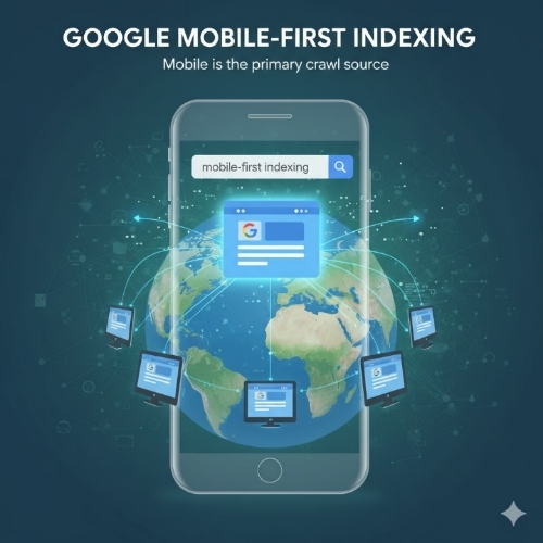
Mobile-First Indexing:
This is Google’s approach to crawling and indexing websites where it predominantly uses the mobile version of a site’s content. Instead of looking at your desktop site first and then considering mobile as secondary, Google flipped the script. Your mobile site is now the primary version that determines your search rankings. If your mobile experience is poor or incomplete, your rankings suffer regardless of how good your desktop site looks. This shift happened because most Google searches now occur on mobile devices, so it makes sense for their index to reflect what most users actually see.
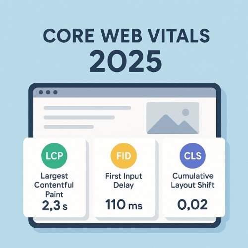
Core Web Vitals:
These are specific metrics Google uses to measure user experience, particularly around page loading performance, interactivity, and visual stability. The three main Core Web Vitals are Largest Contentful Paint which measures loading speed, First Input Delay which measures interactivity, and Cumulative Layout Shift which measures visual stability. On mobile devices, these metrics are especially important because slower connections and less powerful processors make performance issues more noticeable. Poor Core Web Vitals scores can directly impact your search rankings, and mobile performance weighs heavily in these calculations.
Viewport Meta Tag:
This is a small piece of HTML code that controls how your website displays on mobile devices. Without it, mobile browsers try to show the entire desktop version of your site shrunk down to fit a small screen, making everything tiny and hard to read. The viewport meta tag tells the browser to match the website width to the device screen width and set the initial zoom level appropriately. It’s one of the simplest but most important elements for mobile usability, and not having it properly configured will cause immediate problems with mobile-first indexing.
Responsive Design:
This is a web design approach where your site automatically adapts its layout and content to fit different screen sizes and devices. Instead of building separate mobile and desktop websites, responsive design uses flexible grids, images, and CSS media queries to rearrange and resize content based on the viewer’s screen. For mobile-first indexing, responsive design is ideal because it ensures content consistency across devices while optimizing the presentation for each screen size. Google strongly prefers responsive design over other mobile solutions like separate mobile URLs.
Touch Targets:
These are any interactive elements on your website that users tap with their fingers on mobile devices, including buttons, links, menu items, and form fields. Because fingers are less precise than mouse cursors, touch targets need to be larger and more spaced out than desktop clickable elements. Google specifically looks for touch targets that are at least 48 by 48 pixels with adequate spacing between them. Sites with touch targets that are too small or too close together receive mobile usability errors in Search Console, which can negatively impact mobile rankings.
Questions Also Asked by Other People Answered:
Does mobile-first indexing mean Google only uses mobile signals for ranking?
Not exactly. Mobile-first indexing means Google predominantly uses the mobile version of your content for indexing and ranking, but this applies to all users regardless of device. Even someone searching on a desktop computer will see rankings influenced by mobile site quality. However, Google still considers desktop experience as part of the overall picture, especially for websites where most traffic comes from desktop users. The key point is that your mobile version is now the primary version, so if there’s any discrepancy between mobile and desktop content, the mobile version is what matters most for your search visibility.
Will my rankings drop immediately if my mobile site has issues?
Not necessarily immediately, but problems will catch up with you over time. Google doesn’t instantly penalize sites when switching to mobile-first indexing. The transition happens gradually, and Google tries to use the best available version of your content during the process. However, ongoing mobile usability issues, slow load times, or missing content will progressively hurt your rankings as Google increasingly relies on your mobile version. The severity and speed of ranking drops depend on how significant your mobile issues are and how competitive your search space is.
Should I create a separate mobile website or use responsive design?
Responsive design is almost always the better choice. Separate mobile sites using different URLs like m dot example dot com create complications with duplicate content, link equity distribution, and maintenance overhead. Google has to understand the relationship between your desktop and mobile versions using complicated annotations. Responsive design eliminates these problems by serving the same HTML to all devices with CSS adjusting the presentation. It’s simpler to maintain, reduces errors, and is explicitly recommended by Google for mobile-first indexing.
How can I tell if Google is using mobile-first indexing for my site?
Check Google Search Console for a notification. Google typically sends a message when your site switches to mobile-first indexing. You can also look at the Googlebot user agent in your server logs. If most of your crawl traffic comes from the smartphone Googlebot rather than the desktop Googlebot, you’re likely already on mobile-first indexing. Another indicator is checking the URL Inspection tool in Search Console, which will often specify whether the mobile or desktop version was crawled. Most websites have already been moved to mobile-first indexing since Google completed the transition for most of the web by 2021.
Do I need an app to succeed with mobile-first indexing?
No, having a mobile app is completely separate from mobile-first indexing, which refers to your mobile website. You don’t need an app at all to rank well in Google search results. Mobile-first indexing is about how well your mobile website performs, not whether you have a native iOS or Android application. In fact, apps generally don’t appear in regular Google search results at all, except in specific app-focused search features. Focus your energy on making your mobile website excellent rather than feeling pressured to build an app unless it genuinely serves your business goals and user needs.
Summary
Mobile-first indexing represents a fundamental shift in how Google evaluates and ranks websites. Your mobile site is no longer secondary, it’s the primary version Google uses to determine your search visibility. This means ensuring content parity between mobile and desktop versions, optimizing page speed for mobile devices, fixing usability issues like proper viewport settings and touch target sizes, and continuously monitoring performance through Google Search Console.
The good news is that improving mobile-first indexing doesn’t require a complete website overhaul. Simple, methodical improvements like compressing images, ensuring consistent content across devices, fixing basic usability errors, and using responsive design principles can dramatically improve your mobile experience and search rankings. Regular monitoring and testing on actual mobile devices help catch issues before they impact users or search performance.
The most important mindset shift is treating mobile as your primary platform rather than an afterthought. Every content update, design change, or new feature should be tested on mobile first. With most internet users accessing websites through smartphones and Google’s mobile-first approach now fully implemented, your mobile experience directly determines your online success. Start with the basics, measure your progress, and keep iterating toward a better mobile experience for your users and search engines alike.
#WebDevelopment
#MobileFirst
#SEO
#GoogleRankings
#WebDesign
#MobileOptimization
#UserExperience
#SearchEngineOptimization
#WebPerformance
#TechTips