Mobile-First Indexing: A Developer’s Complete Guide to Getting It Right
- “Why Your Desktop Site Looks Perfect But Google Isn’t Ranking It”
“Your mobile site is costing you traffic, and you might not even know it yet.”
Learn how to optimize your site for mobile-first indexing with actionable steps. Fix common issues, improve rankings, and ensure Google sees your best content first—no guesswork needed.
Introduction
I’ll be honest with you. The first time I heard about mobile-first indexing, I thought I had it covered. My sites were responsive. They looked great on phones. I’d even run those mobile-friendly tests Google offers, and everything came back green. So when a client’s traffic dropped by 30 percent over three months, I was confused. The desktop site was flawless. The content was solid. What was going on?
Turns out, I’d made a classic mistake. I assumed responsive design meant mobile-first indexing was handled. It doesn’t. Google wasn’t indexing the beautiful desktop version I’d spent weeks perfecting. It was indexing the mobile version, and that version had problems I didn’t even know existed. Hidden content. Slow load times. Navigation that worked on desktop but fell apart on a phone.
That experience taught me something important. Mobile-first indexing isn’t just about making your site work on phones. It’s about understanding that Google now uses your mobile site as the primary version for ranking, indexing, and determining what your site is actually about. If your mobile experience is lacking, your rankings suffer. Period.
Since 2019, Google has rolled out mobile-first indexing to virtually all websites. If you’re a web developer, this isn’t optional anymore. It’s the foundation. And if you’re still treating mobile as an afterthought or assuming your responsive framework handles everything, you’re leaving rankings on the table.
This guide walks you through exactly how to optimize for mobile-first indexing. I’m going to share the steps I wish someone had given me before that traffic drop. No fluff. No jargon dumps. Just practical, actionable advice you can use today to make sure Google sees your site the way you intend.
Step-by-Step Guide to Improving Mobile-First Indexing for Web Developers
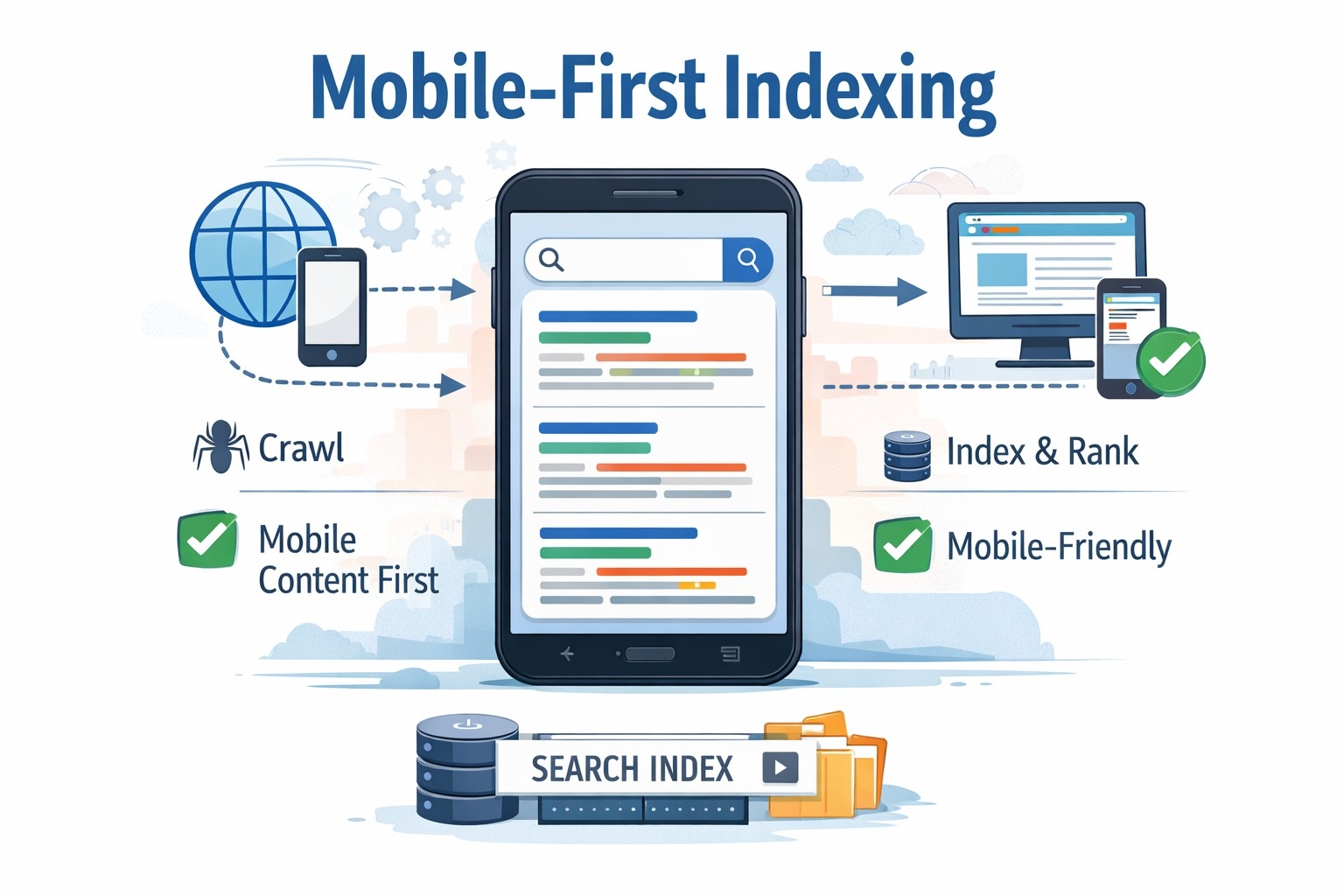
Understand What Mobile-First Indexing Actually Means
Before we dive into fixes, let’s clear up what this actually is. Mobile-first indexing means Google predominantly uses the mobile version of your content for indexing and ranking. It’s not a separate index. There’s still just one index. But Google’s crawler now looks at your mobile site first when deciding what your pages are about and how they should rank.
This shift happened because most searches now come from mobile devices. Google wants to show users results based on what they’ll actually see, not some desktop version they can’t access on their phone.
So if your mobile site is missing content, has different structured data, or loads slower than your desktop version, that’s what Google indexes. And that’s what affects your rankings.
Check If Your Site Has Been Switched
First things first. Find out if Google has already moved your site to mobile-first indexing. Open Google Search Console and look for a notification. Google typically sends a message when they’ve switched your site over.
If you don’t see a message, your site has likely already been migrated. Google completed the rollout for most sites by 2020. But it’s worth checking because understanding where you stand helps you prioritize fixes.
Audit Your Mobile Site Separately
This is where I messed up initially. I tested my desktop site thoroughly but didn’t give the mobile version the same attention. Here’s what you need to do.
Pull up your site on an actual mobile device. Not just a responsive browser view. Use a real phone. Navigate through your pages. Click your menus. Try to find content. Fill out forms. Does everything work smoothly? Is content hidden behind tabs or accordions? Are images loading properly?
Next, use Google’s Mobile-Friendly Test tool. Enter your URL and see what Google’s bot sees. This tool shows you how Googlebot renders your mobile page and flags issues like text that’s too small, clickable elements too close together, or content wider than the screen.
Then use the URL Inspection tool in Search Console. Check a few key pages and look at the mobile version specifically. This shows you exactly what Google indexed from your mobile site.
Ensure Content Parity Between Desktop and Mobile
One of the biggest mistakes I see is content that exists on desktop but disappears on mobile. Maybe you hid it in a collapsed section to save space. Maybe you removed it entirely thinking mobile users don’t need it. Either way, if Google can’t see it on mobile, it doesn’t count.
Go through your main pages and compare. Does your mobile site have the same text, images, videos, and links as your desktop site? If not, you need to add it back.
Hidden content isn’t necessarily bad, but it needs to be accessible. If you’re using tabs, accordions, or expandable sections, make sure Google can crawl and index what’s inside them. Google can generally handle this, but test it to be sure.
Also check your images. Are they all present on mobile? Do they have proper alt text? Google uses images as part of understanding your content. If they’re missing or broken on mobile, that’s a problem.
Optimize Your Mobile Page Speed
Speed matters more on mobile than anywhere else. Mobile users are often on slower connections. They’re impatient. And Google knows this.
Run your site through PageSpeed Insights and look specifically at the mobile score. You want to be in the green, but even if you’re not, focus on the opportunities section. That’s where Google tells you exactly what’s slowing you down.
Common culprits include unoptimized images, render-blocking JavaScript, and oversized CSS files. Here’s what usually helps.
Compress your images. Use modern formats like WebP. Serve images at the size they’ll actually display, not some massive original file.
Minimize your JavaScript and CSS. Remove unused code. Defer non-critical scripts so they don’t block rendering.
Use lazy loading for images and videos below the fold. This makes your initial page load faster because you’re not loading everything at once.
Enable browser caching so repeat visitors don’t have to download everything again.
Consider a content delivery network to serve your files faster regardless of where users are located.
Fix Mobile Usability Issues
Google Search Console has a Mobile Usability report. Check it. This report flags problems like text that’s too small to read, viewport not set correctly, or touch elements too close together.
These issues hurt user experience, and Google pays attention to that. Fix them one by one. Most are straightforward.
Make sure your viewport meta tag is set correctly. It should look something like this: viewport meta tag with width set to device-width and initial-scale set to 1.0.
Use readable font sizes. At least 16 pixels for body text. Users shouldn’t have to zoom to read your content.
Space out clickable elements. Buttons, links, and form fields need enough space around them that users don’t accidentally tap the wrong thing. Aim for at least 48 pixels of touch target size.
Avoid horizontal scrolling. Your content should fit within the screen width. If users have to scroll sideways to see text or images, something’s wrong with your layout.
Match Your Structured Data Across Versions
Structured data helps Google understand your content. If you’re using schema markup on your desktop site, make sure it’s also on your mobile site. And make sure it’s the same.
I once had a client whose mobile site was missing the structured data for their product pages. Google indexed the mobile version, saw no schema, and stopped showing rich results in search. Their click-through rate dropped.
Check your JSON-LD, microdata, or RDFa markup. Use Google’s Rich Results Test tool to verify it’s present and valid on your mobile pages.
Common schema types to check include Article, Product, BreadcrumbList, LocalBusiness, and FAQ. Whatever you’re using on desktop should be on mobile too.
Handle Mobile Navigation Carefully
Navigation is tricky on mobile. You have less screen space, so developers often use hamburger menus or hide secondary navigation entirely. That’s fine, but make sure your important pages are still accessible and crawlable.
Google can crawl content in collapsed menus, but it helps if your most important links are visible or at least easy to find. Use internal linking in your content to help Google discover all your pages.
Test your navigation with Google’s Mobile-Friendly Test. Make sure the bot can see and follow your links.
Also check your site’s architecture. Can users reach any page within three or four clicks from the homepage? If your mobile navigation makes it harder to find content, that’s a problem for both users and search engines.
Monitor Your Mobile Site in Search Console
Once you’ve made improvements, keep an eye on things. Google Search Console is your friend here.
Check the Coverage report regularly. Look for errors or warnings, especially on mobile. If Google can’t index pages on mobile that it could index on desktop, you’ll see it here.
Watch your Core Web Vitals. These metrics measure loading performance, interactivity, and visual stability. Google uses them as ranking factors, and they matter more on mobile where conditions vary.
Look at your Mobile Usability report for new issues. Sometimes updates to your site or CMS can introduce problems you didn’t have before.
Track your impressions and clicks in the Performance report. Filter by device and see how your mobile traffic trends over time. If you see drops after making changes, investigate immediately.
Test on Real Devices and Connections
This can’t be stressed enough. Emulators and responsive design views in browsers are useful, but they don’t tell the whole story.
Test your site on actual phones. Different screen sizes. Different operating systems. iOS and Android handle things differently sometimes.
Also test on slower connections. Use Chrome DevTools to throttle your connection and see how your site performs on 3G or slow 4G. Many mobile users don’t have perfect connections. Your site needs to work for them too.
Ask friends, colleagues, or users to test on their devices. Fresh eyes catch issues you might miss because you know the site too well.
Keep Mobile and Desktop in Sync
As you update your site going forward, make sure changes apply to both versions. Add new content? It goes on mobile too. Update your schema? Do it on both versions. Launch a new feature? Test it on phones before you push it live.
It’s easy to focus on desktop during development and treat mobile as something you’ll check later. Don’t do that. Mobile is your primary version now. Treat it that way from the start.
Use responsive design frameworks that keep things consistent by default. But don’t assume they handle everything. Always test.
Don’t Panic About Older Sites
If you’re working with an older site that wasn’t built with mobile in mind, don’t panic. You don’t need to rebuild everything from scratch. Start with your most important pages. Your homepage. Your top landing pages. Your conversion pages.
Fix those first. Make sure they’re mobile-friendly, fast, and have all their content. Then work through the rest of your site systematically.
Google doesn’t penalize you for having a desktop-focused site. They just rank you based on your mobile version. So the faster you improve that mobile experience, the better your rankings will be.
Important Phrases Explained:
Mobile-First Indexing
This is Google’s method of using the mobile version of a website as the primary source for indexing and ranking. Instead of looking at your desktop site first, Google’s crawlers now prioritize what they see on mobile devices. This shift reflects how people actually use the internet today, with the majority of searches happening on phones and tablets. For developers, it means you can’t design for desktop first and treat mobile as secondary anymore. Your mobile site is your main site in Google’s eyes, and optimizations need to start there.
Responsive Web Design
Responsive design is an approach where your website automatically adapts its layout and content to fit different screen sizes and devices. It uses flexible grids, images, and CSS media queries to create one site that works everywhere. While responsive design is important for mobile-first indexing, being responsive doesn’t automatically mean you’re optimized for it. You still need to ensure your mobile version loads quickly, displays all content, and provides a good user experience. Responsive design is the foundation, but there’s more work to do beyond that.
Core Web Vitals
Core Web Vitals are a set of specific metrics Google uses to measure user experience on your website. They include Largest Contentful Paint, which measures loading performance, First Input Delay, which measures interactivity, and Cumulative Layout Shift, which measures visual stability. These metrics matter more on mobile devices where users expect fast, smooth experiences. Google uses Core Web Vitals as ranking factors, so improving these scores directly impacts your search visibility. They’re not just technical benchmarks but actual user experience indicators.
Structured Data
Structured data is code you add to your website to help search engines understand your content better. It uses standardized formats like JSON-LD or microdata to label information such as products, reviews, events, or articles. When implemented correctly, structured data can enable rich results in search, like star ratings, prices, or event dates appearing directly in search listings. For mobile-first indexing, it’s crucial that your mobile site includes the same structured data as your desktop version. Missing or different schema on mobile means Google might not understand your content properly or show those enhanced search results.
Viewport Meta Tag
The viewport meta tag is a piece of HTML code that tells browsers how to adjust your page’s dimensions and scaling on different devices. Without it, mobile browsers might try to render your page at a desktop width and then shrink it to fit the screen, making everything tiny and hard to read. A properly configured viewport tag ensures your site displays at the right size on mobile devices from the start. It’s one of the most basic requirements for mobile-friendliness, but it’s surprising how many sites still get it wrong or leave it out entirely.
Questions Also Asked by Other People Answered
Does mobile-first indexing mean Google only looks at my mobile site?
Not exactly. Google still indexes both versions of your site if you have separate mobile and desktop versions, or just one version if you use responsive design. But when it comes to ranking and understanding what your site is about, Google primarily uses the mobile version. This means if your mobile site is missing content or has technical issues, those problems affect your rankings even for people searching on desktop computers. The key is ensuring your mobile version represents your site fully and accurately.
Will my rankings drop if my mobile site isn’t optimized?
Possibly, yes. If your mobile site provides a worse experience than your desktop site, such as missing content, slower load times, or usability problems, Google may rank you lower than competitors whose mobile sites perform better. However, Google doesn’t specifically penalize you for not being mobile-optimized. It’s more that you’re competing based on your mobile site’s quality now. If that quality is lower than others in your space, you’ll naturally rank lower. The good news is that improving your mobile experience typically improves rankings fairly quickly.
How do I know if Google has switched my site to mobile-first indexing?
The easiest way is to check Google Search Console. When Google moves your site to mobile-first indexing, they send a notification through Search Console explaining the change. If you don’t see this message, your site has likely already been migrated since Google completed the rollout for most websites by 2020. You can also check your server logs to see which Googlebot user agent is crawling your site most frequently. If it’s the smartphone crawler, you’re on mobile-first indexing.
Can I have different content on mobile and desktop?
Technically yes, but it’s not recommended for mobile-first indexing. If your mobile site has less content than your desktop site, Google will only index what’s on mobile, meaning the additional desktop content won’t help your rankings. Users who find your site through search might also be confused if they see different content than what Google described. The best practice is content parity, meaning the same important content appears on both versions. You can adjust layout and presentation for different screens, but the core content should match.
What’s the difference between mobile-friendly and mobile-first indexing?
Mobile-friendly means your site works well on mobile devices—it’s readable, navigable, and doesn’t require zooming or horizontal scrolling. Mobile-first indexing, on the other hand, refers to which version of your site Google uses for ranking and indexing. A site can be mobile-friendly but still not optimized for mobile-first indexing if, for example, the mobile version is missing content or structured data that exists on desktop. Being mobile-friendly is necessary but not sufficient. You need both a good mobile user experience and full content parity to truly succeed with mobile-first indexing.
Summary:
Mobile-first indexing fundamentally changed how Google evaluates and ranks websites. For web developers, this means treating your mobile site as the primary version rather than an afterthought. The key steps include ensuring content parity between mobile and desktop versions, optimizing page speed for mobile connections, fixing usability issues, maintaining consistent structured data, and continuously monitoring performance through Search Console.
Start by auditing your mobile site separately from desktop. Test on real devices and slower connections to see what actual users experience. Focus on Core Web Vitals, as these metrics directly impact rankings and user satisfaction. Make sure your mobile navigation is accessible and all important content is visible to both users and search engines.
The transition to mobile-first isn’t about rebuilding your entire site overnight. It’s about systematically improving your mobile experience and keeping it in sync with desktop as you make updates. Prioritize your most important pages first, fix critical issues, and then work through the rest of your site methodically. With consistent attention to mobile optimization, your rankings will improve and your users will have a better experience regardless of how they access your site.
#MobileFirstIndexing
#WebDevelopment
#SEO
#GoogleSearch
#MobileOptimization
#WebPerformance
#ResponsiveDesign
#CoreWebVitals
#SearchConsole
#WebDev